As I use the Jupyter notebook with C# integration, I'll add to this list of tricks as I discover them.
Adding collapsed details to jupyter notebooks
I wanted to show hints and answers to questions in the jupyter notebook, but I didn't want them to be directly visible without interaction.

This was done by creating a markdown block with an HTML section inside. When interacted with, the section expands.
<details>
<summary>Summary of the fold</summary>
  ... Content shown after the fold ...
</details>
Summary of the fold
... Content shown after the fold ...And since it's just HTML, it works anywere, including here.
display() function
The C# kernel embedded in Jupyter has some functions that control the output to the cells of the notebook when executed. One of these functions is display().
Tables
It shows properties of objects or lists in a table format. In my linear programming solver examples, I used this command to make a table with the name and value of each problem variable.
display(solver.variables().Select(a => new { Name = a.Name(), Value = a.SolutionValue() }));
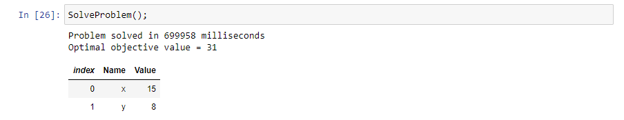
This is an ideal case for C#'s anonymous objects and linq to select the object properties that you want to see in the table. Adding using System.Linq; to your references will allow you to use the .Select( x => new { PropertyHeader = x.PropertyValue, ... }) linq command.
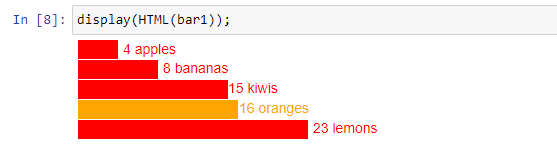
SVGs
I discovered the display(HTML()) function allows you to pass items such as SVGs from inside C# to be rendered below the block. Two examples are the SVG image triange and the bar chart. On top of that, the bar chart is stylable by CSS.
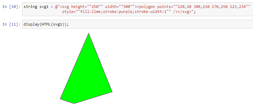
The SVG code is generated inside C#, then the variable containing the SVG is displayed.
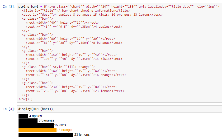
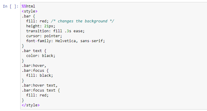
Finally, you can add create a cell containing some CSS (with %%html) , which when executed will change the chart as shown.
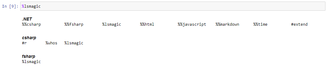
Magic
The %lsmagic command shows a list of commands available to use in code blocks.
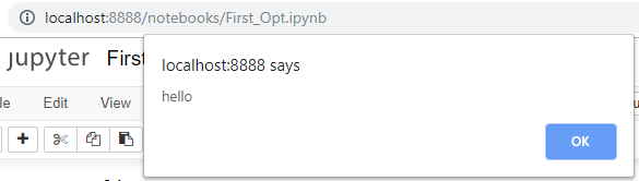
%%javascript
You can execute javascript with the %%javascript magic.

%%html
As previously mentioned, the %%html command will allow you to add CSS blocks and any other HTML output directly into the Jupyter output cell.
%%time
Gives you access to the wall time. Actual time took to execution of the cell.
%whos
Gives you access to the list of currently defined variable in the memory of the notebook. Also lists the type and value (as a "toString() representation) of the objects.
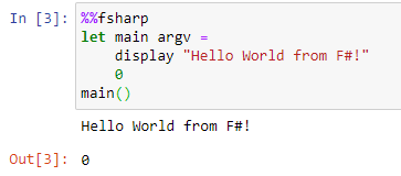
%%fsharp
You can intermingle C# and F# code inside one notebook, as long as they are in different cells. You can switch to F# by prefixing the cell with %%fsharp
let main argv =
    display "Hello World from F#!"
    0
main()
Graphing from C#
We can chart using Xplot.Plotly.
//Install XPlot package
#r "nuget:XPlot.Plotly,2.0.0"
using XPlot.Plotly;
Input data:
DateTime now = DateTime.Now;
var imax = 8760;
var rand = new Random();
double[] data = Enumerable.Range(1, imax).Select(x => 20.0 + 15.0 * Math.Sin(x/60.0) + 12 * rand.NextDouble()).ToArray();
DateTime[] tp = Enumerable.Range(1, imax).Select(x => now.AddHours(x) ).ToArray();

int totalNumberForBarChart = 3;
double[] actualFares = new [] {3.4, 12.3, 20.42};
double[] predictionFares = new [] {7.4, 14.3, 18.42};
int[] elements = Enumerable.Range(0, totalNumberForBarChart).ToArray();
my samples are here C# charts
Two bar plot
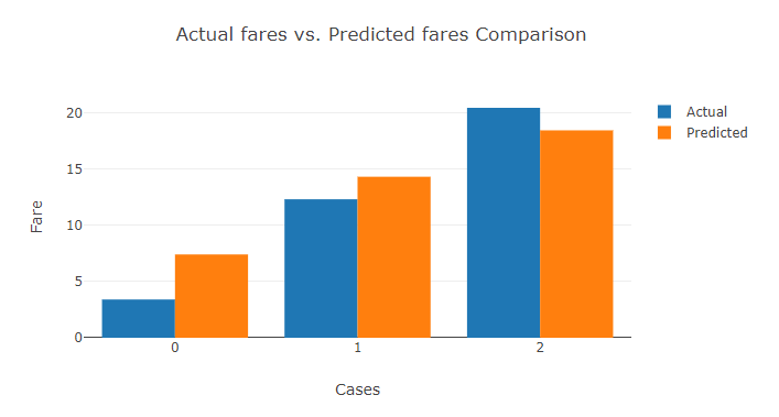
// Define group for Actual values
var ActualValuesGroupBarGraph = new Graph.Bar()
{
   x = elements,
   y = actualFares,
   name = "Actual"
};

// Define group for Prediction values
var PredictionValuesGroupBarGraph = new Graph.Bar()
{
   x = elements,
   y = predictionFares,
   name = "Predicted"
};

var chart = Chart.Plot(new[] {ActualValuesGroupBarGraph, PredictionValuesGroupBarGraph});
var layout = new Layout.Layout(){barmode = "group", title="Actual fares vs. Predicted fares Comparison"};
chart.WithLayout(layout);
chart.WithXTitle("Cases");
chart.WithYTitle("Fare");
chart.WithLegend(true);
chart.Width = 700;
chart.Height = 400;

display(chart);
Histogram
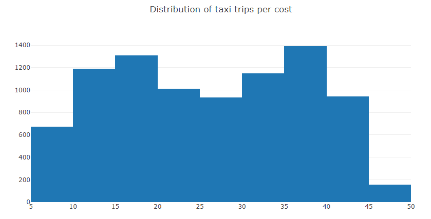
var faresHistogram = Chart.Plot(new Graph.Histogram(){x = data, autobinx = false, nbinsx = 20});
var layout = new Layout.Layout(){title="Distribution of taxi trips per cost"};
faresHistogram.WithLayout(layout);

display(faresHistogram);
Scatter
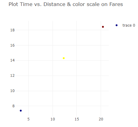
var chart = Chart.Plot(
    new Graph.Scatter()
    {
        x = actualFares,
        y = predictionFares,
        mode = "markers",
        marker = new Graph.Marker()
        {
            color = predictionFares,
            colorscale = "Jet"
        }
    }
);

var layout = new Layout.Layout(){title="Plot Time vs. Distance & color scale on Fares"};
chart.WithLayout(layout);
chart.Width = 500;
chart.Height = 500;
chart.WithLegend(true);

display(chart);
Line chart with scatter
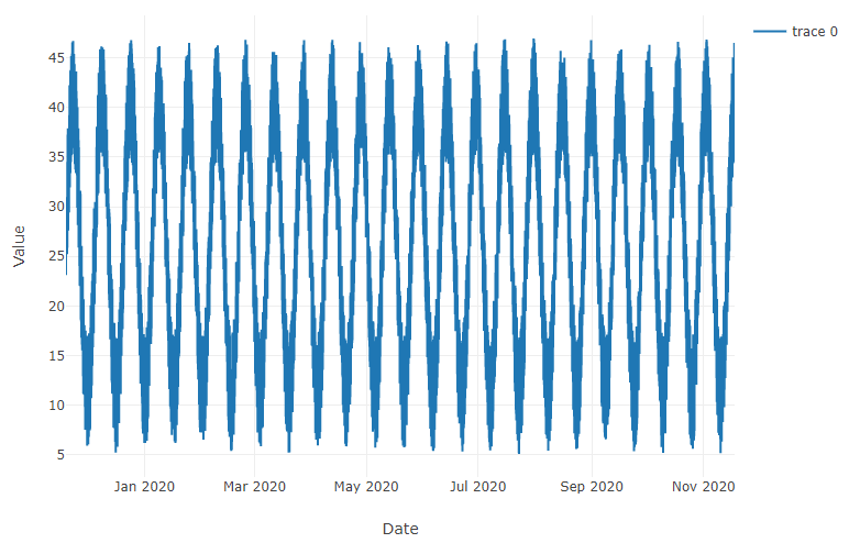
var linedUp = new Graph.Scatter()
{
    x = tp,
    y = data,
    mode = "lines",
};

var chart = Chart.Plot(linedUp);
chart.WithXTitle("Date");
chart.WithYTitle("Value");
chart.WithLegend(true);
chart.Width = 1200;
chart.Height = 600;
display(chart);